Creative Direction
Design
©2026
Creative Direction
Design
©2026

Kardion
Kardion, a medtech company founded in Stuttgart, Germany, engineers cutting-edge cardiac devices. The company has operated in stealth mode for years, prioritizing the quality and viability of its products over the traditional marketing and fundraising efforts of a startup. As Kardion expanded their transatlantic team and grew closer to launching products, the moment arrived to prepare for their public debut.
We collaborated with stakeholders to deeply understand the carefully cultivated, pioneering culture at the heart of Kardion. We crafted a brand story centered around the passage of time: surgeons seek to gain and make the most of time during surgery, patients hope to gain time and opportunity for their life after surgery, and it all hinges on one moment in the OR. Precisely where Kardion fits in.
Client
:
Kardion
Studio
:
Shinebox
Role
:
Creative Director
Year
:
Ongoing
Tap or Drag
Tap or Drag
Tap or Drag
Kardion
Kardion, a medtech company founded in Stuttgart, Germany, engineers cutting-edge cardiac devices. The company has operated in stealth mode for years, prioritizing the quality and viability of its products over the traditional marketing and fundraising efforts of a startup. As Kardion expanded their transatlantic team and grew closer to launching products, the moment arrived to prepare for their public debut.
We collaborated with stakeholders to deeply understand the carefully cultivated, pioneering culture at the heart of Kardion. We crafted a brand story centered around the passage of time: surgeons seek to gain and make the most of time during surgery, patients hope to gain time and opportunity for their life after surgery, and it all hinges on one moment in the OR. Precisely where Kardion fits in.
Client
:
Kardion
Studio
:
Shinebox
Role
:
Creative Director
Year
:
Ongoing
Tap or Drag
Tap or Drag
Tap or Drag
Kardion
Kardion, a medtech company founded in Stuttgart, Germany, engineers cutting-edge cardiac devices. The company has operated in stealth mode for years, prioritizing the quality and viability of its products over the traditional marketing and fundraising efforts of a startup. As Kardion expanded their transatlantic team and grew closer to launching products, the moment arrived to prepare for their public debut.
We collaborated with stakeholders to deeply understand the carefully cultivated, pioneering culture at the heart of Kardion. We crafted a brand story centered around the passage of time: surgeons seek to gain and make the most of time during surgery, patients hope to gain time and opportunity for their life after surgery, and it all hinges on one moment in the OR. Precisely where Kardion fits in.
Client
:
Kardion
Studio
:
Shinebox
Role
:
Creative Director
Year
:
Ongoing
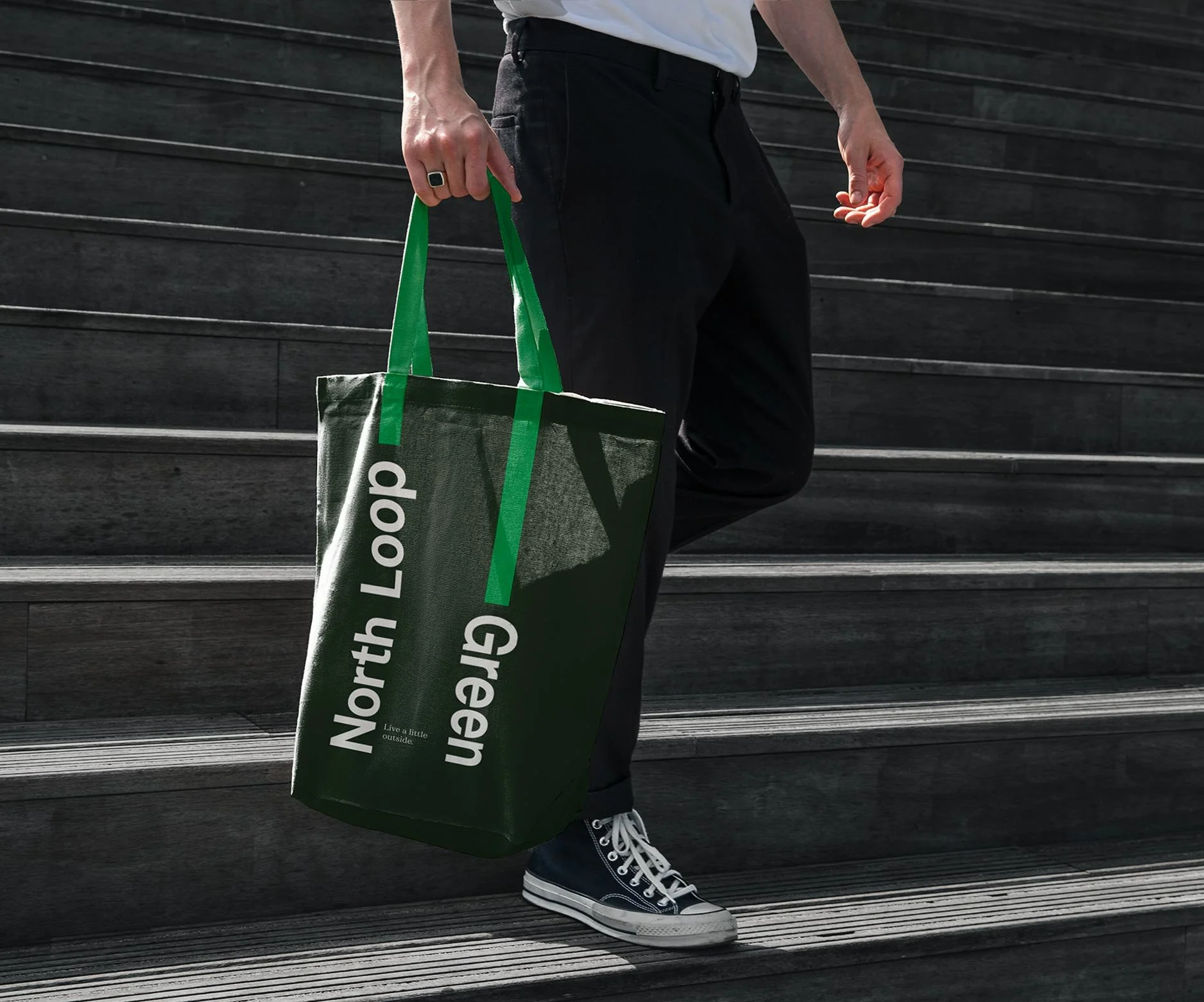


North Loop Green
A former rail yard by the Twins Stadium and light rail in Minneapolis has become North Loop Green—a dynamic hub linking Downtown and the North Loop. What was once a transient space is now a vibrant community destination with homes, workplaces, businesses, events, and a public green at its heart.
We created and positioned a transit inspired identity system that reflected North Loop Green’s role as a connector to all things Minneapolis. The always-changing logo system celebrates unique individual journeys, destinations, and the moments of connection along the way.
Client
:
Hines Construction
Studio
:
Fellow Inc.
Role
:
Senior Designer
Year
:
2019
Tap or Drag
Tap or Drag
Tap or Drag
North Loop Green
A former rail yard by the Twins Stadium and light rail in Minneapolis has become North Loop Green—a dynamic hub linking Downtown and the North Loop. What was once a transient space is now a vibrant community destination with homes, workplaces, businesses, events, and a public green at its heart.
We created and positioned a transit inspired identity system that reflected North Loop Green’s role as a connector to all things Minneapolis. The always-changing logo system celebrates unique individual journeys, destinations, and the moments of connection along the way.
Client
:
Hines Construction
Studio
:
Fellow Inc.
Role
:
Senior Designer
Year
:
2019
Tap or Drag
Tap or Drag
Tap or Drag
North Loop Green
A former rail yard by the Twins Stadium and light rail in Minneapolis has become North Loop Green—a dynamic hub linking Downtown and the North Loop. What was once a transient space is now a vibrant community destination with homes, workplaces, businesses, events, and a public green at its heart.
We created and positioned a transit inspired identity system that reflected North Loop Green’s role as a connector to all things Minneapolis. The always-changing logo system celebrates unique individual journeys, destinations, and the moments of connection along the way.
Client
:
Hines Construction
Studio
:
Fellow Inc.
Role
:
Senior Designer
Year
:
2019


Clarity
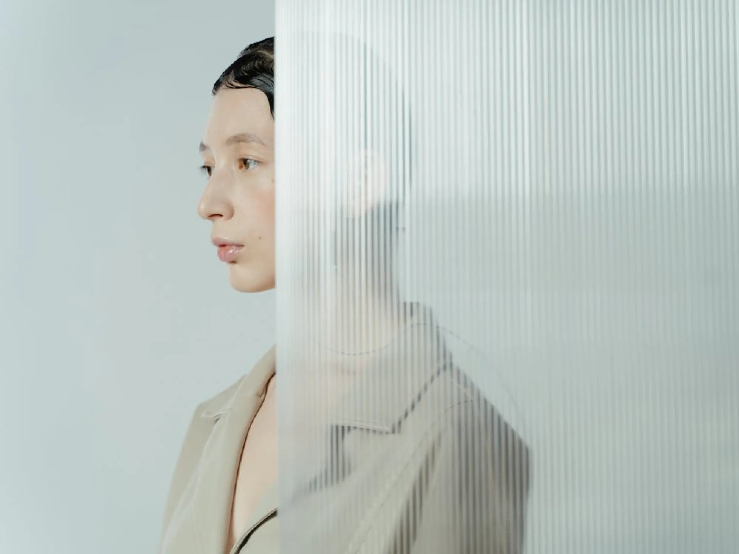
Arvenza is a modern fashion label defined by quiet sophistication and deliberate design. With a focus on minimalism, refined textures, and timeless silhouettes, the brand speaks to those who find power in subtlety.
This visual identity explores veiled clarity — a balance of transparency and restraint. Muted tones, soft layering, and partial concealment reflect Arvenza’s core: elegance, introspection, and quiet confidence.
Client
:
Solventum
Agency
:
Shinebox
Role
:
Creative Director
Year
:
2024
Tap or Drag
Tap or Drag
Tap or Drag
Clarity
Arvenza is a modern fashion label defined by quiet sophistication and deliberate design. With a focus on minimalism, refined textures, and timeless silhouettes, the brand speaks to those who find power in subtlety.
This visual identity explores veiled clarity — a balance of transparency and restraint. Muted tones, soft layering, and partial concealment reflect Arvenza’s core: elegance, introspection, and quiet confidence.
Client
:
Solventum
Agency
:
Shinebox
Role
:
Creative Director
Year
:
2024
Tap or Drag
Tap or Drag
Tap or Drag
Clarity
Arvenza is a modern fashion label defined by quiet sophistication and deliberate design. With a focus on minimalism, refined textures, and timeless silhouettes, the brand speaks to those who find power in subtlety.
This visual identity explores veiled clarity — a balance of transparency and restraint. Muted tones, soft layering, and partial concealment reflect Arvenza’s core: elegance, introspection, and quiet confidence.
Client
:
Solventum
Agency
:
Shinebox
Role
:
Creative Director
Year
:
2024

Leijona
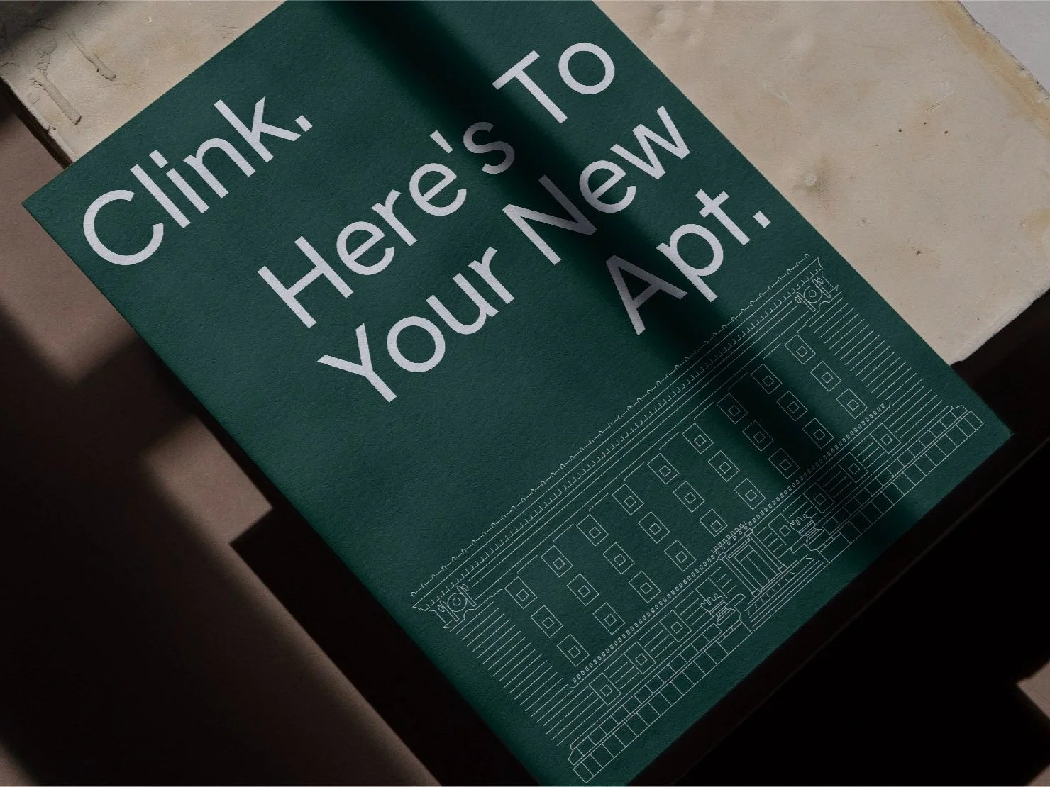
The historic St. Louis County Jail in Duluth MN was purchased and an ambitious plan put in place to adapt it into apartments. We developed a brand for this Jail turned home that helped market the property to a broad range of demographics.
We developed brand positioning for the building by focusing on what’s next. The diverse range of people starting something new here, and finding a home. The name and identity that paid homage to the history of the area & architecture while celebrating all the stories that will come next.
Amazingly, between the hard work put into adapting the building and the compelling brand that activated it, people continue to choose to rent an apartment that used to be a jail cell.
Client
:
Solventum
Agency
:
Fellow Inc.
Role
:
Senior Designer
Year
:
2019
Tap or Drag
Tap or Drag
Tap or Drag
Leijona
The historic St. Louis County Jail in Duluth MN was purchased and an ambitious plan put in place to adapt it into apartments. We developed a brand for this Jail turned home that helped market the property to a broad range of demographics.
We developed brand positioning for the building by focusing on what’s next. The diverse range of people starting something new here, and finding a home. The name and identity that paid homage to the history of the area & architecture while celebrating all the stories that will come next.
Amazingly, between the hard work put into adapting the building and the compelling brand that activated it, people continue to choose to rent an apartment that used to be a jail cell.
Client
:
Solventum
Agency
:
Fellow Inc.
Role
:
Senior Designer
Year
:
2019
Tap or Drag
Tap or Drag
Tap or Drag
Leijona
The historic St. Louis County Jail in Duluth MN was purchased and an ambitious plan put in place to adapt it into apartments. We developed a brand for this Jail turned home that helped market the property to a broad range of demographics.
We developed brand positioning for the building by focusing on what’s next. The diverse range of people starting something new here, and finding a home. The name and identity that paid homage to the history of the area & architecture while celebrating all the stories that will come next.
Amazingly, between the hard work put into adapting the building and the compelling brand that activated it, people continue to choose to rent an apartment that used to be a jail cell.
Client
:
Solventum
Agency
:
Fellow Inc.
Role
:
Senior Designer
Year
:
2019
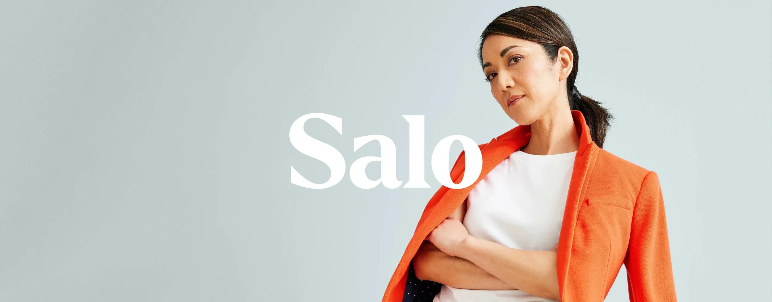
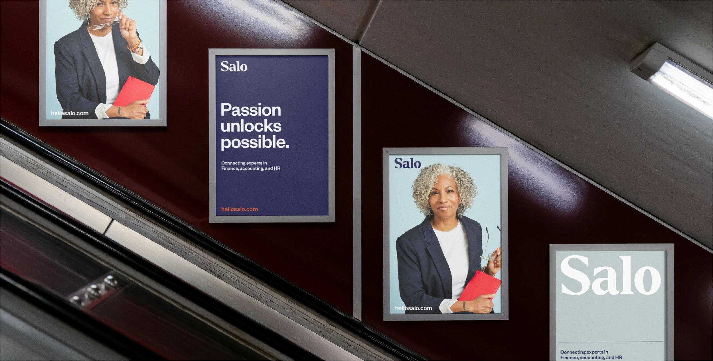
Salo
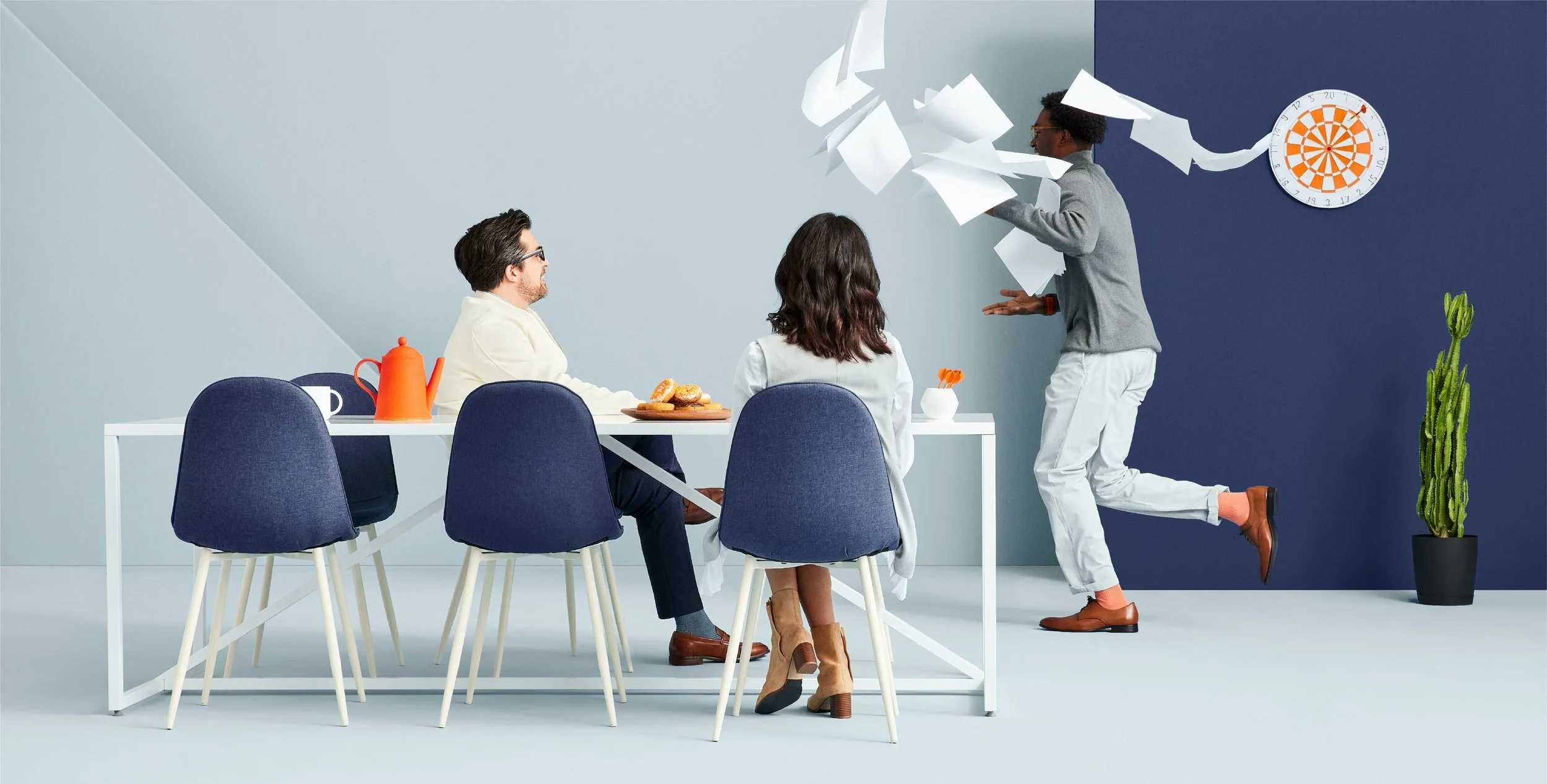
Salo was an independent HR, finance, and accounting consultancy who were poised to go national. They sought a new brand identity that better communicated their unique philosophy: that real business advantages result from working with the diverse perspective of fulfilled talent.
We created a new brand identity that positioned Salo as a leader in the national conversations on the “future of work”. The new Salo brand celebrated the empowered individual, their approachable expertise, and the strength of diverse perspectives coming together.
Client
:
Solventum
Agency
:
Fellow Inc.
Role
:
Senior Designer
Year
:
2019
Tap or Drag
Tap or Drag
Tap or Drag
Salo
Salo was an independent HR, finance, and accounting consultancy who were poised to go national. They sought a new brand identity that better communicated their unique philosophy: that real business advantages result from working with the diverse perspective of fulfilled talent.
We created a new brand identity that positioned Salo as a leader in the national conversations on the “future of work”. The new Salo brand celebrated the empowered individual, their approachable expertise, and the strength of diverse perspectives coming together.
Client
:
Solventum
Agency
:
Fellow Inc.
Role
:
Senior Designer
Year
:
2019
Tap or Drag
Tap or Drag
Tap or Drag
Salo
Salo was an independent HR, finance, and accounting consultancy who were poised to go national. They sought a new brand identity that better communicated their unique philosophy: that real business advantages result from working with the diverse perspective of fulfilled talent.
We created a new brand identity that positioned Salo as a leader in the national conversations on the “future of work”. The new Salo brand celebrated the empowered individual, their approachable expertise, and the strength of diverse perspectives coming together.
Client
:
Solventum
Agency
:
Fellow Inc.
Role
:
Senior Designer
Year
:
2019

Bold Forward
Description
Client
:
Mayo Clinic
Agency
:
Fellow Inc.
Role
:
Senior Designer
Year
:
2019
Tap or Drag
Tap or Drag
Tap or Drag
Bold Forward
Description
Client
:
Mayo Clinic
Agency
:
Fellow Inc.
Role
:
Senior Designer
Year
:
2019
Tap or Drag
Tap or Drag
Tap or Drag
Bold Forward
Description
Client
:
Mayo Clinic
Agency
:
Fellow Inc.
Role
:
Senior Designer
Year
:
2019
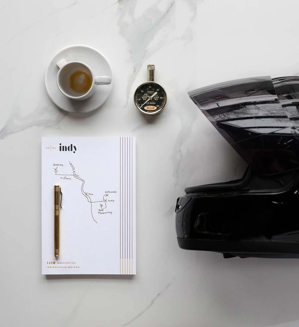
Hotel Indy
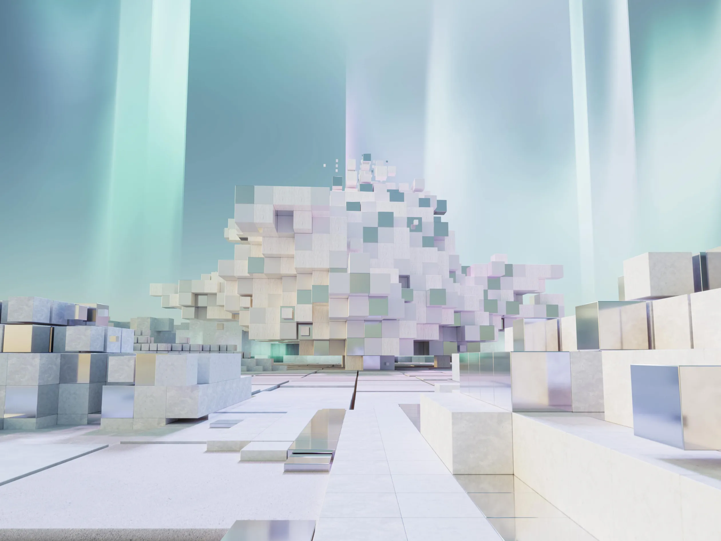
Hotel Indy is a study in adaptive reuse. We stripped away the austerity of a decommissioned mid-century brutalist office building to reveal a vibrant downtown destination. Our creative direction was fueled by a singular tension: how to honor the building’s 60s lineage and Indianapolis’s racing heritage without succumbing to the literalism of a "theme" hotel.
Instead, we drew from the city’s lineage of independent thinkers—the unapologetic trailblazers who defined the Indianapolis spirit. The result is a design language that leans into mid-century texture and racing-inspired sophistication, creating a cohesive guest experience anchored by a rooftop disco, a high-touch lobby bar, and an elevated supper club. By positioning Hotel Indy as a sanctuary for the uncommon, we transformed a vacant relic into a cultural heartbeat for the city.
Client
:
Ratio
Role
:
Senior Designer
Year
:
2021
Tap or Drag
Tap or Drag
Tap or Drag
Hotel Indy
Hotel Indy is a study in adaptive reuse. We stripped away the austerity of a decommissioned mid-century brutalist office building to reveal a vibrant downtown destination. Our creative direction was fueled by a singular tension: how to honor the building’s 60s lineage and Indianapolis’s racing heritage without succumbing to the literalism of a "theme" hotel.
Instead, we drew from the city’s lineage of independent thinkers—the unapologetic trailblazers who defined the Indianapolis spirit. The result is a design language that leans into mid-century texture and racing-inspired sophistication, creating a cohesive guest experience anchored by a rooftop disco, a high-touch lobby bar, and an elevated supper club. By positioning Hotel Indy as a sanctuary for the uncommon, we transformed a vacant relic into a cultural heartbeat for the city.
Client
:
Ratio
Role
:
Senior Designer
Year
:
2021
Tap or Drag
Tap or Drag
Tap or Drag
Hotel Indy
Hotel Indy is a study in adaptive reuse. We stripped away the austerity of a decommissioned mid-century brutalist office building to reveal a vibrant downtown destination. Our creative direction was fueled by a singular tension: how to honor the building’s 60s lineage and Indianapolis’s racing heritage without succumbing to the literalism of a "theme" hotel.
Instead, we drew from the city’s lineage of independent thinkers—the unapologetic trailblazers who defined the Indianapolis spirit. The result is a design language that leans into mid-century texture and racing-inspired sophistication, creating a cohesive guest experience anchored by a rooftop disco, a high-touch lobby bar, and an elevated supper club. By positioning Hotel Indy as a sanctuary for the uncommon, we transformed a vacant relic into a cultural heartbeat for the city.
Client
:
Ratio
Role
:
Senior Designer
Year
:
2021

Harbor Health
Harbor Health, a healthcare startup, aimed to rebuild the US healthcare system from the ground up. We refined a brand strategy and created an identity for their Phase 1 launch in Austin, Texas. Harbor goes beyond traditional health services, connecting with a variety of approaches to comprehensive proactive care (specialists, physicians, yogis, therapists, etc.) and rewarding members that follow through by proactively take care of their health.
Harbor represents a new lifestyle for all those who want to flourish. A friendly and energetic brand invites people to join Harbor and co-create their health.
The result was a thriving Harbor Health, who has expanded across Austin with clinic locations, digital treatment options, and mobile health services that come to you.
Client
:
Harbor Health
Agency
:
Fellow Inc.
Role
:
Senior Designer
Year
:
2019
Tap or Drag
Tap or Drag
Tap or Drag
Harbor Health
Harbor Health, a healthcare startup, aimed to rebuild the US healthcare system from the ground up. We refined a brand strategy and created an identity for their Phase 1 launch in Austin, Texas. Harbor goes beyond traditional health services, connecting with a variety of approaches to comprehensive proactive care (specialists, physicians, yogis, therapists, etc.) and rewarding members that follow through by proactively take care of their health.
Harbor represents a new lifestyle for all those who want to flourish. A friendly and energetic brand invites people to join Harbor and co-create their health.
The result was a thriving Harbor Health, who has expanded across Austin with clinic locations, digital treatment options, and mobile health services that come to you.
Client
:
Harbor Health
Agency
:
Fellow Inc.
Role
:
Senior Designer
Year
:
2019
Tap or Drag
Tap or Drag
Tap or Drag
Harbor Health
Harbor Health, a healthcare startup, aimed to rebuild the US healthcare system from the ground up. We refined a brand strategy and created an identity for their Phase 1 launch in Austin, Texas. Harbor goes beyond traditional health services, connecting with a variety of approaches to comprehensive proactive care (specialists, physicians, yogis, therapists, etc.) and rewarding members that follow through by proactively take care of their health.
Harbor represents a new lifestyle for all those who want to flourish. A friendly and energetic brand invites people to join Harbor and co-create their health.
The result was a thriving Harbor Health, who has expanded across Austin with clinic locations, digital treatment options, and mobile health services that come to you.
Client
:
Harbor Health
Agency
:
Fellow Inc.
Role
:
Senior Designer
Year
:
2019


Equine Network
VoidAI is an intent-aware AI interface that actively chooses when to respond and when to stay silent.
It’s a thinking layer that respects context, emotion, and timing. Like a good collaborator, VoidAI contributes with purpose — surfacing the right insight, at the right time, in the right way.
Its identity is built around contrast: light from dark, meaning from absence, signal from void. It reflects a human way of thinking: calm, precise, aware.
Tap or Drag
Tap or Drag
Tap or Drag
Equine Network
VoidAI is an intent-aware AI interface that actively chooses when to respond and when to stay silent.
It’s a thinking layer that respects context, emotion, and timing. Like a good collaborator, VoidAI contributes with purpose — surfacing the right insight, at the right time, in the right way.
Its identity is built around contrast: light from dark, meaning from absence, signal from void. It reflects a human way of thinking: calm, precise, aware.
Tap or Drag
Tap or Drag
Tap or Drag
Equine Network
VoidAI is an intent-aware AI interface that actively chooses when to respond and when to stay silent.
It’s a thinking layer that respects context, emotion, and timing. Like a good collaborator, VoidAI contributes with purpose — surfacing the right insight, at the right time, in the right way.
Its identity is built around contrast: light from dark, meaning from absence, signal from void. It reflects a human way of thinking: calm, precise, aware.
The Warehouse District
The Warehouse District had everything a great entertainment neighborhood needs: legendary venues, three pro sports franchises, a thriving theater corridor, and historic architecture. But since the pandemic, perceptions of "unsafe, declining, gone" had been repeated so often that they passed for fact, even as First Avenue kept selling out and Target Center kept filling up.
The response started in the neighborhood itself with reinvigorated business and civic investment. That investment kicked off with a fresh identity and brand story for The District, a vibrant design system loud enough to hold sports, music, art, and theater in the same frame, and a vision for refreshed infrastructure so the experience on the streets will match the energy of the attractions.
Client
:
Minneapolis Renaissance Coalition
Role
:
Creative Director
Year
:
2026
Tap or Drag
Tap or Drag
Tap or Drag
The Warehouse District
The Warehouse District had everything a great entertainment neighborhood needs: legendary venues, three pro sports franchises, a thriving theater corridor, and historic architecture. But since the pandemic, perceptions of "unsafe, declining, gone" had been repeated so often that they passed for fact, even as First Avenue kept selling out and Target Center kept filling up.
The response started in the neighborhood itself with reinvigorated business and civic investment. That investment kicked off with a fresh identity and brand story for The District, a vibrant design system loud enough to hold sports, music, art, and theater in the same frame, and a vision for refreshed infrastructure so the experience on the streets will match the energy of the attractions.
Client
:
Minneapolis Renaissance Coalition
Role
:
Creative Director
Year
:
2026
Tap or Drag
Tap or Drag
Tap or Drag
The Warehouse District
The Warehouse District had everything a great entertainment neighborhood needs: legendary venues, three pro sports franchises, a thriving theater corridor, and historic architecture. But since the pandemic, perceptions of "unsafe, declining, gone" had been repeated so often that they passed for fact, even as First Avenue kept selling out and Target Center kept filling up.
The response started in the neighborhood itself with reinvigorated business and civic investment. That investment kicked off with a fresh identity and brand story for The District, a vibrant design system loud enough to hold sports, music, art, and theater in the same frame, and a vision for refreshed infrastructure so the experience on the streets will match the energy of the attractions.
Client
:
Minneapolis Renaissance Coalition
Role
:
Creative Director
Year
:
2026


The Virginian Lodge
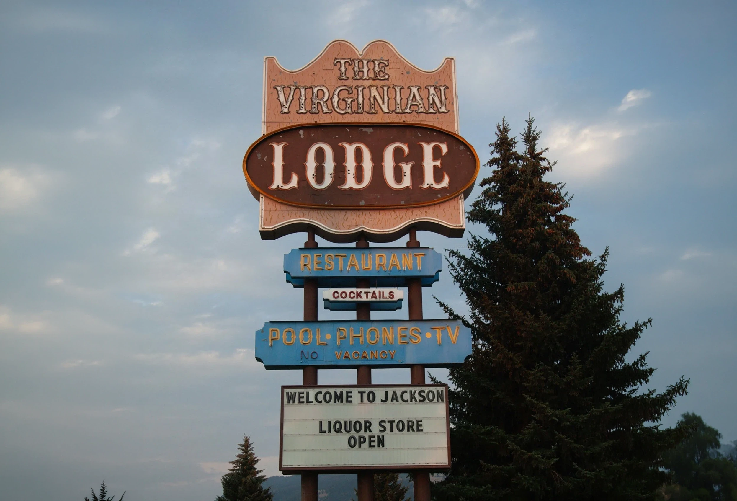
Outbound Hotels purchased The Virginian Lodge to recreate the rugged motor lodge into a more modern and approachable version of itself. The rebrand sought to stay true to the history and culture of Jackson, Wyoming.
We developed a fresh identity that balanced rugged authenticity with approachable hospitality. By digging into the history of the property and preserving the unique, we created a new brand identity that turned the mantra of its original owner to always “Keep It Western” into a rally cry.
Client
:
Outbound Hotels
Role
:
Senior Designer
Year
:
2021
Tap or Drag
Tap or Drag
Tap or Drag
The Virginian Lodge
Outbound Hotels purchased The Virginian Lodge to recreate the rugged motor lodge into a more modern and approachable version of itself. The rebrand sought to stay true to the history and culture of Jackson, Wyoming.
We developed a fresh identity that balanced rugged authenticity with approachable hospitality. By digging into the history of the property and preserving the unique, we created a new brand identity that turned the mantra of its original owner to always “Keep It Western” into a rally cry.
Client
:
Outbound Hotels
Role
:
Senior Designer
Year
:
2021
Tap or Drag
Tap or Drag
Tap or Drag
The Virginian Lodge
Outbound Hotels purchased The Virginian Lodge to recreate the rugged motor lodge into a more modern and approachable version of itself. The rebrand sought to stay true to the history and culture of Jackson, Wyoming.
We developed a fresh identity that balanced rugged authenticity with approachable hospitality. By digging into the history of the property and preserving the unique, we created a new brand identity that turned the mantra of its original owner to always “Keep It Western” into a rally cry.
Client
:
Outbound Hotels
Role
:
Senior Designer
Year
:
2021

The Hulman
A research tool that visualizes knowledge like a growing tree: organic, branching, and alive. Inspired by the calm clarity of nature, it helps researchers uncover deep connections through intuitive, ambient exploration rather than linear search.
The brand identity, crafted by me, reflects this philosophy: minimal, luminous, and rooted in stillness. A space where discovery feels natural.
Client
:
Ratio
Role
:
Senior Designer
Year
:
2021
Tap or Drag
Tap or Drag
Tap or Drag
The Hulman
A research tool that visualizes knowledge like a growing tree: organic, branching, and alive. Inspired by the calm clarity of nature, it helps researchers uncover deep connections through intuitive, ambient exploration rather than linear search.
The brand identity, crafted by me, reflects this philosophy: minimal, luminous, and rooted in stillness. A space where discovery feels natural.
Client
:
Ratio
Role
:
Senior Designer
Year
:
2021
Tap or Drag
Tap or Drag
Tap or Drag
The Hulman
A research tool that visualizes knowledge like a growing tree: organic, branching, and alive. Inspired by the calm clarity of nature, it helps researchers uncover deep connections through intuitive, ambient exploration rather than linear search.
The brand identity, crafted by me, reflects this philosophy: minimal, luminous, and rooted in stillness. A space where discovery feels natural.
Client
:
Ratio
Role
:
Senior Designer
Year
:
2021

The Cannon Ball Lounge
A research tool that visualizes knowledge like a growing tree: organic, branching, and alive. Inspired by the calm clarity of nature, it helps researchers uncover deep connections through intuitive, ambient exploration rather than linear search.
The brand identity, crafted by me, reflects this philosophy: minimal, luminous, and rooted in stillness. A space where discovery feels natural.
Client
:
Ratio
Role
:
Senior Designer
Year
:
2021
Tap or Drag
Tap or Drag
Tap or Drag
The Cannon Ball Lounge
A research tool that visualizes knowledge like a growing tree: organic, branching, and alive. Inspired by the calm clarity of nature, it helps researchers uncover deep connections through intuitive, ambient exploration rather than linear search.
The brand identity, crafted by me, reflects this philosophy: minimal, luminous, and rooted in stillness. A space where discovery feels natural.
Client
:
Ratio
Role
:
Senior Designer
Year
:
2021
Tap or Drag
Tap or Drag
Tap or Drag
The Cannon Ball Lounge
A research tool that visualizes knowledge like a growing tree: organic, branching, and alive. Inspired by the calm clarity of nature, it helps researchers uncover deep connections through intuitive, ambient exploration rather than linear search.
The brand identity, crafted by me, reflects this philosophy: minimal, luminous, and rooted in stillness. A space where discovery feels natural.
Client
:
Ratio
Role
:
Senior Designer
Year
:
2021


David's Deli
A research tool that visualizes knowledge like a growing tree: organic, branching, and alive. Inspired by the calm clarity of nature, it helps researchers uncover deep connections through intuitive, ambient exploration rather than linear search.
The brand identity, crafted by me, reflects this philosophy: minimal, luminous, and rooted in stillness. A space where discovery feels natural.
Tap or Drag
Tap or Drag
Tap or Drag
David's Deli
A research tool that visualizes knowledge like a growing tree: organic, branching, and alive. Inspired by the calm clarity of nature, it helps researchers uncover deep connections through intuitive, ambient exploration rather than linear search.
The brand identity, crafted by me, reflects this philosophy: minimal, luminous, and rooted in stillness. A space where discovery feels natural.
Tap or Drag
Tap or Drag
Tap or Drag
David's Deli
A research tool that visualizes knowledge like a growing tree: organic, branching, and alive. Inspired by the calm clarity of nature, it helps researchers uncover deep connections through intuitive, ambient exploration rather than linear search.
The brand identity, crafted by me, reflects this philosophy: minimal, luminous, and rooted in stillness. A space where discovery feels natural.
Creative Direction
Design
©2026
Click or Drag
Click or Drag
Click or Drag
Kardion
Kardion, a medtech company founded in Stuttgart, Germany, engineers cutting-edge cardiac devices. The company has operated in stealth mode for years, prioritizing the quality and viability of its products over the traditional marketing and fundraising efforts of a startup. As Kardion expanded their transatlantic team and grew closer to launching products, the moment arrived to prepare for their public debut.
We collaborated with stakeholders to deeply understand the carefully cultivated, pioneering culture at the heart of Kardion. We crafted a brand story centered around the passage of time: surgeons seek to gain and make the most of time during surgery, patients hope to gain time and opportunity for their life after surgery, and it all hinges on one moment in the OR. Precisely where Kardion fits in.
Label
:
Text
Label
:
Text
Label
:
Text
Label
:
Text
Label
:
Text